As bonus, I am featuring various sample images, relics, or artifacts of the “past”.
Failed, forgotten and/or ignored however they were – throughout this initiative’s ten years.
For adjunct reading, I recommend my Original Authorship Statement (PDF Download). As well – if you wish you can download the entire repository of Social media artifacts (back then – in Google+ prior to their shutdown as well as manual-reposts in LinkedIN) please see here.
I thank you once again, for visiting the Internet’s least visited independent thoughts in wellness and nutrition.
Live-It-Forward.
Andrew Wiguna
AW / andrewwiguna.com

Social Media
This includes LilnkedIN & Google+ 2015 onwards. For context I was trying to offer on top of my job applications (mounting to hundreds, throughout five years/ six years) through proving(s) of my skills of the trade into something more…benevolent.
Trivia 1/3
Of all the dozens of the post artifactings – my “favourite” quote was from the movie City of God.
Why? Because it presents duality between imaginary ~ indulgence and guilt. A caveat here is that this was perceived / interpreted / translated as a voiced / narration from the main character “Buscape” ; “Young Rocket” – as it was translated from Portoguese.
In any case, the movie was extremely heavy (on the head). Whilst the camera work could do a little bit more empathetic for the audience (too much emphasis on fixed portrait lens + POV movements + hand held story telling = very fatiguing to the optics) ~ it’s the saying above that pretty much reflects human nature.
Other accompanying design artifacting


The First rebrand (Nutritional Humility)


Trivia 2/3
“Humility Through Frugality” was too much of a mouthful. And the somewhat too-rigid of its delivery impression (typography speaking) may need a little more “softening” .
Hence in 2017 I decided to undergo a rebrand.
Taking all that I could connote with conventionally self-less, charitably state of mind, combined also with wisdom to respect the academia that which helped pave my personal understanding of nutrition.
Together – coincidentally this also form implied imagery of the book, a fork and the apple.
I do not use “spoon” because that usually denotes “larger” appetites. Fork on the other hand? there is something nimble about it that one threads with careful reflection as one interacts with food.
About the cover image

Trivia 3/3
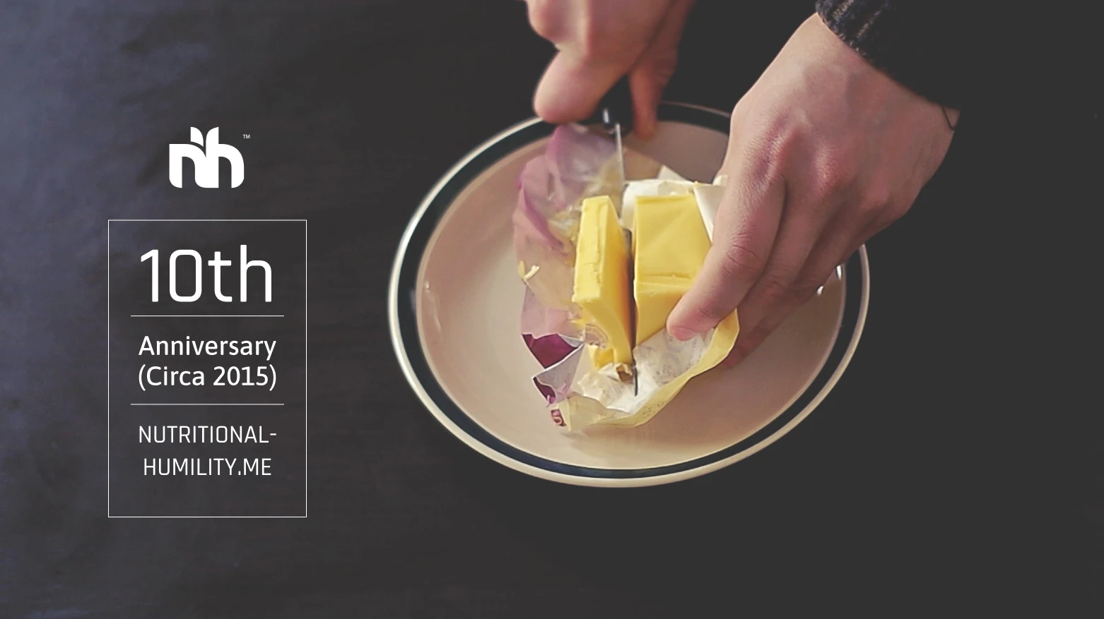
So…Why Butter? Why not Bread and butter?
The above cover image has been used far too often.
For multiple reasons. Why “butter”? Well firstly they taste nothing one could ever replicate with “food-like” products. The moral title “Bread and Butter” to me, especially if I am expected by the audience use literal image of bread and butter ~ is far too boring, too conventional and Religiously connotated.
Why not, also paying respect to the body’s own natural energy reservoir, that one taps into during ketosis and/or fasting?
That – was the rationale.
Thank you
Please consider reading the last prior parts of this feature write-up.
Live-It-Forward,
AW.


