
Fasting. Authentication. Inquire. Repeat
Cliff
PREFACE & LIVE PUBLIC DRAFT NOTICE. Major Update: Saturday 31st January 2026: FIGMA FIGJAM Public sharing of user flows. Here in this part 2 - the meat and bones of this concept IP. As disclaimer again, this is my own idea, and as such - I am willing to share my thoughts as soon as […]PREFACE & LIVE PUBLIC DRAFT NOTICE.
Major Update: Saturday 31st January 2026: FIGMA FIGJAM Public sharing of user flows.
Here in this part 2 - the meat and bones of this concept IP. As disclaimer again, this is my own idea, and as such - I am willing to share my thoughts as soon as I feel confident at sharing them. Consequently, the writings aren't perfect ~ incomplete passages, split / missing connections between phrases, typo’s to name a few.
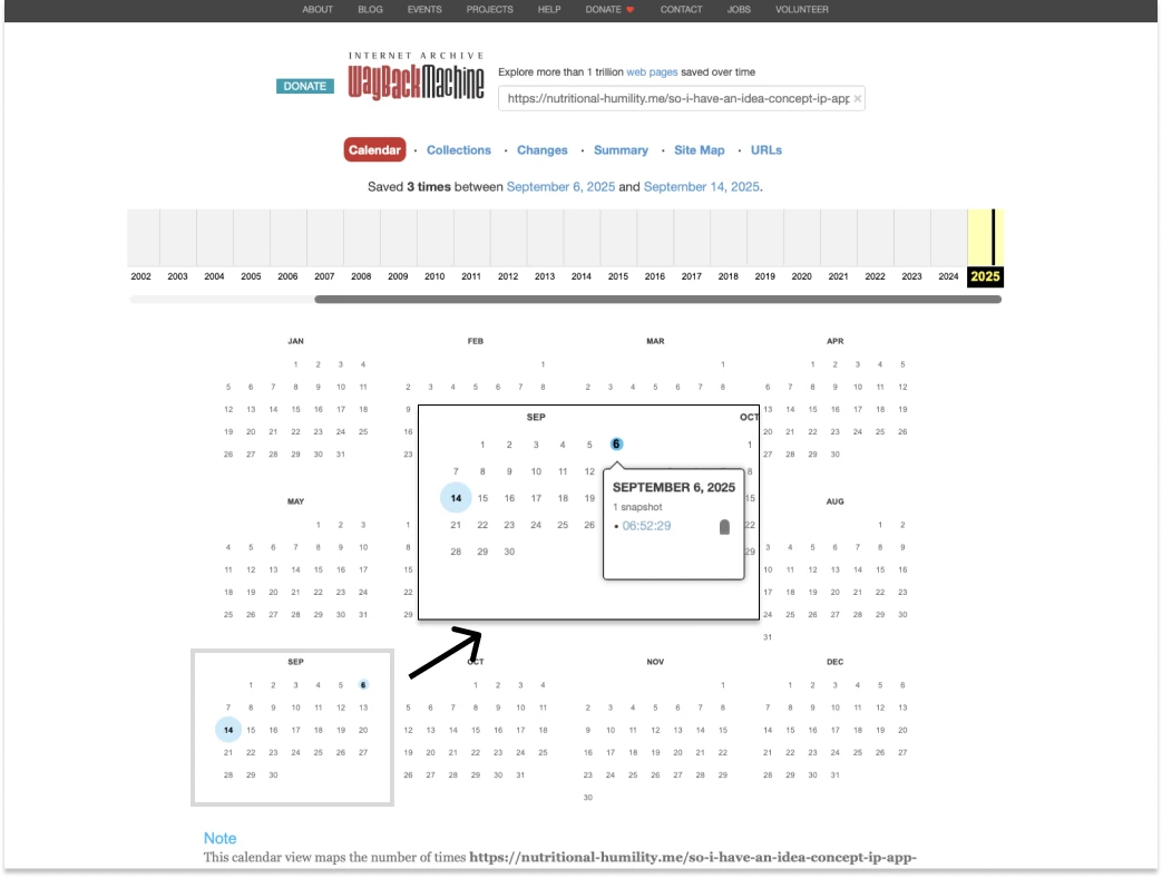
I have begun manually “stamping” this article series' URL into the Internet’s Wayback Machine as a way for historic “imprint”, commencing as of Saturday 6th September 2025, as seen below. That way, I hope this prove as evidence that my work on this indeed started exactly on the date that I manually and initially initiate the date stamping on the Wayback Machine. For proof that I am the sole author behind this channel, please view my authorship evidence and statement(scroll to point #5).
Use of AI Statement. For context and clarity, throughout this entire channel (including prior book, and current YouTube® channel) have NOT relied on any sort of AI or generative tools for content writing. I am my own "one-man" channel, and I have not sought any support on third party marketers, proof readers, checkers, or buying "fake" traffic bots.
HOWEVER as for this "concept" idea here - does necessitate some AI concepts. But the what and how? Is where I simply I do not know. What I do know is that this entire product IP would be next to useless without it.
Having said all that let’s begin.
In Part 1….
I contextualised my app around the idea that journalling - at least in retrospect off my own - is a mental encoding/decoding exercise subject to loathsome routines. I highlighted that writing about ourselves, is not immune to our own inherent biases.
The "bias" here is what I refer to as an intentional, “closed-loop” conversation system, Any kind of Journalling is at best - a closed-loop conversation, outlet and/or "arena" so to speak. Here I am referring the word "closed" as to both the deliberate and self-induced and orchestrated - encoding and then decoding - back to the writer him/herself. Nobody, therefore as an "outside" interpreter from an unbiased view is ever allowed to witness.
I realise that in light of this, another “perspective” or "observer" is arguably, needed. But not in a manner that is "judgmental" per se. Rather - an observer that simply notifies and informs. No value judgment. No stigma attached. No virtue signalling.
This does take some time explaining. Please expect heavy re-writing(s) here. Apologies for the hassle.
Another "person" to watch over, but not necessarily to "converse".
So “who” is that exactly? That - is where AI agent implementation comes in, someway shape or form.
A clear reason for this is for the analytical support. To reflect, assess and research, on user's behalf on what they took, eaten consumed, exercised, excluded, reincluided, not just a day ago comparatively. But weeks, months or even years prior.
Can we really “remind” ourselves what we've written? A day, a week a month or perhaps year - later? By intuition - perhaps we should reword that as "speculation" ~ perhaps.
Is that our ego speaking? Maybe. Maybe not.
Daily life and hustles are already hectic enough as is. Even PhDs researchers, names need not mentioned but channels whom I look up to over the years - couldn't even remember, when asked what one had for breakfast.
So that - wraps up Part 1. And here is ~ the What, and the how.

At a glance
Not a macro or micro’s calculator. But a journalling app catered for nutrition insights with biometric inputs. This app is envisioned to be an upgrade over the existing Google® template previously offered bi-annually releases or six month iterations.
The tool allows daily metric inputs starting with fasting glucose levels, ketones, weight readings [upon rising + after training]. As well ~ entires allocated on intake of macro or micronutrient supplementations taken in a variety of sub-contexts (eg. After rising, before training, or at specified time period).
A Conventional, 3-time-slot based (mornings, afternoons and evenings) journaling entries are provided with secondary entries dedicated for:
- micro / macronutrient supplementation journalling.
- Fitness and exercise training journal.
All entries are posited to have a rich text (RTE) formatting facility.
At the heart of its technological incentive, is the inclusion of AI analytic agent. What this is , is a conversational prompt dialogue not too dissimilar to ChatGPT or Claude - but primarily it is encouraged to be used as an analytical enquiry for reasons discussed earlier.
The What
The What - Context, Landscape & Peers
It is perhaps safe to say that the very definition of Health and/or Fitness remains superficially the same, universally at that - of saturated, vanity endowment. One may argue that health is nothing more than reproductive fitness.
However what is not equally shared, is our own reasoning for getting there. Or at least, getting what we want.
Too many people believe that "health" is a "thing" to "Get". Health or fitness is not an object.
"Health" and/or “fitness”, as seen and decoded here throughout this concept initiative since its beginnings ten years ago - is much less of a fixed outcome. Rather a lifelong side effect at maintaining pledges towards self-authenticity.
“Side effect’ here requires as one expects, an enforced change of habits, on how one rationalises consumptions and therefore - decisions. As reminder again, philosophically - nutrition is ration and/or "reason" - that precursors life, at present.
So, in this train of thought of searching for "reasons" - is where health is individualistic, very individualistic at that way of self-actualisation that is yet to happen. What is arguably missing, is the. vehicle for us to continue on this momentum as "cope" . That - takes incredible amount of acknowledgment from the outside.
"None of us is perfect" or so they say. Yet we are consistently dragged, into moral tug-of-war to be "better". "Better than last time". Harder than last time. One has to ask at some stage, whether this is acknowledgment or belittling.
The so called “Clean eating”, “Healthy vs “not healthy” semantic subscriptions and narratives ~ likely predispose users to feel a certain obligation likewise - to align to a "certain" environment. That, which in returns, reinforces a persona they wish to aspire to.
But an unspoken question within this aspiration is - is that really, what the user "wants"?
If journalling is all about empowerment and affirming to that as self-accountability, then how would one have to face one's own prior or grave guilts or mistakes?
Visualising the "individuality" / style-agnostic
Unlike its peers - it aims to be (somehow) free of branding alignment bias typical to that as a health or fitness "narrative" per-se. Light, fluffy clouds, "tech(y)" purple and blue hazy gradient meshes, soft yellows, pastels...all these are overly done and promote restrictive frame of mind that likewise enforces Socrate's classical oath "first do no harm".
At first, there is nothing one can critique against these trends. Especially in realms of graphic design - anything aesthetic visual can be subjective.
Hence to take a lateral approach, here the app must be in ways that is (despite very difficult in its portrayal and logistics) as "agnostic" as possible in terms of expectations. Other than it facilitates the user comfort, acknowledgment and assurance one needs to disclose honesty and thus journal ~ their routines and findings.
So how would I imagine this? I would speculate that:
- The interface be customizable, to a degree at least within UX conventions that the user then recoordinate a colour scheming of the interface as however they so choose.
- And 2 ~ proper onboarding / welcoming experience, Q&A based, to set up and truly personalise the experience so that the right environment is catered for and from - the user's input. This is where I shall admit - AI feature to come into place; to empathise by preparing and tailoring the user's visual comfort. Here I would imagine the AI to analyse the response received and then tailor/skin the UI for the user.
If there. is one very loose analogy to this would be a perceived influence off a design philosophy known as "Utilitarianism". Remnants of stylistic influences / perhaps stemming by its typography and design elements first and foremost - from highly "functional" environments and contexts. Eg. fax machines. type writers. Print test pages. Barcodes. This however, remains only at best an early indicative influence and is not by any means a "locked in" decision.
This passage shall once again be revised overtime.
The Who
Demographics, user base and persona. Adults aged 20+, middle income, gender/culture/religion agnostics.
< more collateral /design artifact commencing soon > A sample persona (initially generated by AI but heavily re-written for re-contextualization) is provided below alongside the customer lead capture journey mapping.
The How
Here I discuss and elaborate the user journey samples, various Widgets to summarise the app’s surface functionalities.
The Pages and/or View(s)
Generally there are two (2) visual views that User can navigate the web app.
- The Dashboard view where the moveable user Blocks / Widgets reside
- The Detailed view ~ is where each Block / Widget is shown in detail, occupying the entire screen.
The user Blocks / widgets
These blocks and/or widgets are movable components that can be placed on the user’s Dashboard Grid; allowing modularity and customisation. These can be placed or occupying the Grid as:
- A row spanning multiple columns (up to four)
- An individual cell
At the time of writing this, depending on the responsive layout / state of the web app (Desktop, tablet and tablet) the Grid layout comprises of
- 3x3 (desktop)
- 2x2 (tablet)
- 1 (column) x up to 4 rows each with sliding arrows to indicate segmented view of information for readibility.
The following lists the Widgets that are move-able, in the order of (expected/ anticipated) usage priority :
- The Entry
- Comprises of three time sub-blocks Mornings, Afternoons, Evenings. RTE text input.
- Additional entries include:
- Biometrics - glucose readings, pre or post (selectable) weight readings, fasting ketones (optional). RTE text input.
- Training/exercises notes - RTE text input.
- Supplement usage notes - RTE text input.
- The Calendar
- Condensed view of the Date, Day, Week (Mo-Su), Month indicator including Year. Left and arrow keys for navigation.
- There is a “view more” CTA which takes the user to the Detailed Widget view
- At-a-glance mini graphical statistics
- Acting as front hero statistics displaying (dynamic) feedback return on the entries inputted thus far. The following is only an indicative sample that may not be generally applied across all users, dependent on the context and/or questions gathered during the Onboarding process.
- Last 7 days trend: fasting glucose, fasting ketones,
- “Newly introduced variable” - a short reminder over a newly recognised / recently added - repeating information. (Truncated text display of no more than three lines worth before auto truncation.
- There is a “view more” CTA which takes the user to the Detailed Widget view
- Acting as front hero statistics displaying (dynamic) feedback return on the entries inputted thus far. The following is only an indicative sample that may not be generally applied across all users, dependent on the context and/or questions gathered during the Onboarding process.
The How - user journey samples
Now - onto the nitty gritty. For those unacquainted "user journey" here is as it implies, a narrated journey to inform designer, developers and PMs/ product manager the intent of a customer from point A to point B.
Yes the above is what you see - the real work in progress user flow. Please be respectful as this is my own personal intellectual property, work and effort.
SAMPLE FLOW #1 from beginning to dashboard arrival, is as follows.
- From funnel marketing landing website, signs up and register as a new user.
- The user opens the Webapp (if on mobile) or if on desktop - clicks on the login CTA.
- The user logs in by entering existing credentials.
- The Onboarding experience begins. Firstly with a disclaimer and welcome pop up modal, affirming that:
- FIRST MOST prominent header / section- clause on AI usage and data collection during onboarding experience - informing the user that in order to visually personalise and coordinate the app to user’s circumstance, emphasising that the more answers the user provide, the more personalised and individualised experience will be returned.
- SECOND MOST prominent header / section - responsible use / terms and conditions
- User-end indemnity - emphasising that this app is limited to that as an indirect / adjunct self-analytics and perhaps not to pro-act as complete substitute to third party practitioner/s that may pre-empt more rigorous diagnosis ~ eg. Nutrigenomics. ; Provided user’s sufficient indemnity and/or level of knowledge / acumen surrounding health, nutrition and fitness remains at his/her confidence.
- <Agree / Proceed button> <I disagree / Closes the app and returns to the login screen.
- The questionnaire then begins - assessing:
- The user’s current state of health
- Existing concerns as various categories
- Metabolic health <category>
- Psychology health <category>
- Exercise physiology <category>
- <An option to skip “I will complete this later”>
- Existing concerns as various categories
- The user’s current and/or level of knowledge of nutrition
- Existing habits
- Existing routines
- <An option to skip “I will complete this later”>
- The user’s current and/or level of knowledge of exercise
- Existing schedules and/or routines
- <An option to skip “I will complete this later”>
- The user’s current state of health
- Upon completion of questionnaire, be greeted the Dashboard; complete with personalised colour scheming and personalised arrangement of widgets.
SAMPLE FLOW #2 -(Journal) Creating a daily entry
There are two (2) ways to input a daily entry. Either ~ directly at the Entry Widget on the Dashboard. Or ~ selecting any date within the calendar which by default opens that day entry in Detailed view.
- User taps/clicks on the main [Add/+] button. Or alternatively clicks on a calendar.
- And makes / adds the entry into their respective categories Mornings, Afternoons, Evenings as well as allocating them as either exercise/training, biometrics or supplement usage notes.
Other noteworthy things (WIP / long list to come).
1/2 Gamification and Streaks
It's increasingly expected among app designs these days to offer gamifications or streaks somewhere in their feature. What this is - is primarily to entice retention (or "Loyalty") of app's overall usage and reciprocation of a user's involvement with the app. By ways of micro interactions paid or unpaid - list of tasks or activities that are, as the name implies similar to that "as game" in exchange for reward "points" or experience points or tokens that which the user can unlock certain features of an app.
In my opinion in the seat of an end user, these are NOT only annoying, and incessantly intrusive. So too - raises the question on the profiteering motive.
On top of - subscription model which is sadly and unfortunately the only likely route for app maintenance, upkeep, servicing, updates and so on - the gamification also adds further complexity, that which is for the betterment of this conceptual phase only - adds unnecessary encumbrance.
At the moment / as it presently stands - my concept idea here remains as a "NO" ~ from incorporating similar schemes. I would argue that this feature is more reserved towards entertainment (or perhaps arguably can be applied as well also ) - to "edu"tainment apps as well. However, contextually I wish to remain relevant to the user's intrinsic individuality and their needs. Overtly (or covertly) capitalisation on their actions and interactions indeed invite many moral greys.
2/2 Third Party Integrations? Macro Caclculators?
Understandably the major limitation in this concept app is that this is more of a supplementarily / adjunction journaling for one's nutrition and personal status. It is not "an all in one " - macro or calorie calculators. To integrate such a system would be unwieldy complex bordering legal territories that are, obviously, carry their own unknowns.
Further it is not currently foreseeable in terms of feasibility, whether third party integrations with other known health related tools and/or apps (eg. intermittent fasting app "Zero" or "Levels" continuous glucose monitoring) is possible.
At least during this hypothetical conceptual planning stage such is likely not to be implmeneted. This is because of legalities that involved from restriction of sharing or gaining access to - an app's integrative programming likely constitute logistics, knowledge resources that is arguably way too far, over and above the scope of this conceptual disclosure phase that could ever be written by a single (1) person / author, alone.
Nonetheless during onboarding there would be reminders and/or repeated notices; akin to Limitations Disclosures. To affirm and remind users of the above limitations. That for instance - macro calculations, despite offered as an adjunct integration within the AI assisted analysis model - the actual tracking duties however, much best remain reserved to another apps altogether namely Chronometer and Myfitness Pal.
Hence, in the present / time being - as a concept - users would remain encouraged to continue their usage amidst already and strongly established ~ solutions surrounding macros, calculators, as well as - any other advanced personal management tools (eg. Notion) that one typically resorts as to however best suit their level of acquaintance and familiarity.
<Hereby concludes the WIP public live draft >
Live-It-Forward,
AW
<Hereby concludes the WIP public live draft >
Live-It-Forward,
AW